brand & package design.
Brand Redesign • Creative Directed
Challenge: With more than a decade on the shelf, the food club brand looked dated and dismal. Shoppers were clamoring for a newer, more contemporary brand look.
Insight: Focus groups were conducted that revealed consumer desire for happy, bright graphics with easy-to-read claim information on the front of the pack.
Solution: We listened to our consumers and gave them a bright, fresh, optimistic food club. A fun, iconic “loop” graces the front of pack, with bright color coding, simple fonts that call out product names and flavors, and easy to read claim “bubbles.” Product photography features strong appetite appeal and serves as the focal point on all packaging. For consumers seeking better options to suit their dietary needs, we re-introduced the Essential Choice line, but needed to distinguish it from the regular product line. Bold, blue was used to differentiate the line along with an “active person” icon connected to the “loop” and back panel photography that featured images of active lifestyles.
Results: Food Club now features a contemporary line look across 3000 skus from center store to frozen and dairy. Shoppers now have a brand they can feel good about, and more of them are joining “the club” every day!
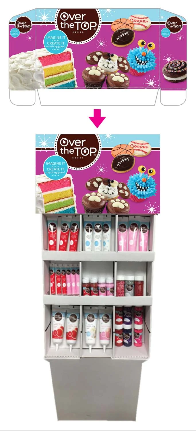
New Brand Development • Creative Directed
Challenge: An extremely limited foray into cake decorating accessories left us to design a new, fun, and interesting brand within severe printing restrictions that allowed for only 3 spot colors.
Insight: A simple, eye-catching & highly appealing design would be needed to compete with the national brand while allowing it to grow within the category within consistent brand equity guardrails.
Solution: A simple 1-color logo & a fun, pale blue and brown brand look translates across the full line and works seamlessly with an endless array of flavor colors. Simple, graphic fireworks reverse out from the brand blue & flavor color to signify fun, excitement & the “life of the party.” A full display, sales kit & cookbook were also created to help sell the brand into stores.
Results: It may have started with just a few sprinkles, but Over the Top has grown steadily over the years into a complete, competitive & extremely eye-catching cake decorating brand!
Brand Redesign • Creative Directed
Challenge: After eight years on-shelf, Full Circle Market was overdue for a fresh, new look. Having grown to 800+ skus throughout the store from fresh, organic produce to multi-grain chips to best-of-nature household cleaners, Full Circle Market needed to differentiate its offerings while maintaining strong brand recognition at shelf.
Insight: With a growing segment of consumers shopping for best-of-nature and organic brands, it was important for this redesign to immediately and unambiguously convey product attributes to Full Circle Market shoppers as well as to new-to-the-brand consumers.
Solution: A brown kraft paper background now distinguishes the organic products from the clean, white paper background of its best-of-nature line. A green claim area across the entire line reinforces individual product attributes while consistent usage of brand logo and simple typography for product names and flavors allow a cohesive, consistent brand look.
Results: Now shoppers can feel confident in immediately recognizing brand attributes, aisle to aisle and product to product. What started as a small organic brand has now come “full circle” to provide sustenance and solutions in every aisle of the store.
New Brand Development • Creative Directed & Logo Design
Challenge: With the emergence of a new generation of coffee “connoisseiurs,” grocery clients expressed a strong interest in developing a full premium, private label coffee line.
Insight: With a bunch of new coffee brands flooding the marketplace, each begging consumers to take their package seriously, the best way to way stand out in this overcrowded aisle was to offer up a smile!
Solution: Big, white eyes (printed with three hits of white to achieve the brightest white possible) with coffee bean pupils are featured on a brown kraft paper background beneath bold block letters exclaiming the brand name and its benefit… WIDE AWAKE! Starting with our signature Breakfast Blend Owl, a different, carefully chosen, “Wide Awake” animal adorns each coffee flavor, creating an adorable menagerie on-shelf. The decaf version of each flavor features its “flavor signifier” animal with its eyelids set hilariously at half-mast.
Results: The fun characters with their oversized, coffee bean eyes stand apart from other brands on-shelf and create a playful and endearing connection to customers. What had started simply as a line of bagged coffee has grown to include single serve cups, creamers, cold brew and even iced coffee featuring a delightfully alert penguin.
Brand Redesign • Creative Directed & Designed
Challenge: ValuTime’s uninteresting, noncompetitive and dated design made this low-tier option a low-interest brand as well.
Insight: By instilling the brand with its own distinct personality, we could breathe new life and new interest into the brand on-shelf. A disruptive and highly ownable design was needed to stand apart from the big brands as well as their me-too counterparts.
Solution: ValuTime was redesigned with a distinctively modern take on a decidedly retro look. A bright, primary color palette and fun, bold type font bring immediate shelf impact, while amusing, endearing stick figures, the Smart Family, comically interact with the product on every ValuTime item.
Results: With customers sharing in the Smart Family’s bright, bold & wholesome fun, they now feel good about bringing this value brand home to their families. Try not to smile while viewing!
New Brand Development • Creative Directed & Designed
Challenge: When visiting our client’s stores, we noticed that the bakery section in particular was filled with a parade of different, disconnected brands of varying quality and consistency.
Insight: We needed to offer our clients a cohesive and consistent brand that could be extended across the full bakery department.
Solution: A fun logo featuring a happy bird perched upon bouncy, hand-lettered type font sits comfortably within a simple, hand-drawn doily pattern, announcing a new and better bakeshop standard… Sweet P’s. Sweetly decadent bakery temptations are presented with the logo displayed on a dark brown polka-dot background, while fun, colorful, kid-friendly cookies and cupcakes are coded in a bright vibrant hot pink.
Results: The client’s stores now boast a consistently higher quality bakeshop, and Sweet P’s enhances store revenue and continues to grow as a brand. Sweet P’s is a sweet success!
New Brand Development • Creative Directed
Challenge: Charged with the huge task of creating a new non-food mega brand and getting it on shelf in a span of only 12 months.
Insight: We needed to find a way to create a singular, consistent placement for the brand logo to reside amidst a vast number of packaging sizes and substrates. Within the initial challenge was the added complication that some products were comparable to national brand while other products were not comparable. We needed to draw a distinct differentiation on shelf while finding a way to maintain a singular brand look.
Solution: The overall design is differentiated by 2 unique and different design strategies. The logo with its distinctive check mark icon is placed consistently in the upper left throughout, but for products with a National Brand Equivalent, additional color cue areas, reminiscent background shapes/patterns and typography help the consumer understand that the product is an NBE. For products with no national brand match, a simple teal background is used throughout. For both strategies, the fonts remain easy to read and strong splashes of teal and bright green are easily recognizable and eye-catching at shelf.
Results: This powerhouse, non-food mega-brand now offers more than 800 products from light bulbs to bath tissue to batteries to household cleaners. Despite its tight timelines and design complex hurdles, this brand is now… Simply Done!
New Brand Development • Creative Directed & Designed
Challenge: Clients’ mainstream offering was Topcare, a functional, utilitarian brand that was getting no looks compared to the national beauty brands.
Insight: Our clients needed an exquisite beauty brand with looks and offerings that not only competed with the nationals, but could actually turn heads with desire.
Solution: Using natural elements to develop a premium assortment of high performance beauty products, we created a brand our clients and their shoppers can b•leve in. The design exudes a striking, yet undemanding look of simple elegance. Refined, subdued, calming colors differentiate categories while pearlized bottles and metallic inks dress up this brand with a premium allure. Brand offerings are further sub-branded to suggest the product benefit. Color protecting shampoo products are offered as b•colorful, while body lotion is sub-branded as b•passionate, and skin care products as b•luminous or b•youthful.
Result: We showed our clients how to b•successful in the marketplace with a simply stunning beauty brand.
Brand Redesign • Creative Directed & Designed
Challenge: The Shurfine brand was in need of a redesign, but the client wanted us to find a new and different approach that could differentiate ShurFine from other mainstream brands.
Insight: Rather than offering a product that looks exactly the same as every other offering on the shelf, why not use the packaging experience as an opportunity to arouse, inspire and delight?
Solution: Consumers can now expect the unexpected with product photography that presents the product in a new and unexpected way. Why show just another picture of a fudge brownie on a plate when you can inspire your shoppers to get creative… a little ice cream and chocolate sauce can make it even better! Colorful and easy to navigate packaging features humorous “tongue-in-cheek,” handwritten copy on every package, while serving suggestions and back panel recipes help consumers relate to the brand as a friend and partner in the kitchen.
Results: With a full in-store POS campaign and website, the Shurfine brand relates to consumers in store and at home, while increasing storewide sales by encouraging trial of inspiration “suggestions.”
Brand Redesign • Creative Directed
Challenge: With more than a decade on the shelf, the topcare brand looked dated and dismal. A few of the categories were “refreshed” throughout the years but it never resonated with consumers. To stay competitive with the other beauty brands, TopCare needed to be segmented by category to be easy for consumers to shop. It needed to be segmented but also needed have a consistent, cohesive look and feel across all categories.
Result: The brand was categorized by Health, Beauty & Everyday. Colorful iconography was developed to be connected to the TopCare brand mark.